Mood Board as a Compass – Building a Collection from the Inside Out
Craft of Meaning - Design led studio, surface patterns, photography, bespoke art, storytelling
Part 2 of 2: Design Process Behind My Iris-Inspired Botanical Patterns
Building a Mood Board – A Journey Through Texture and Memory
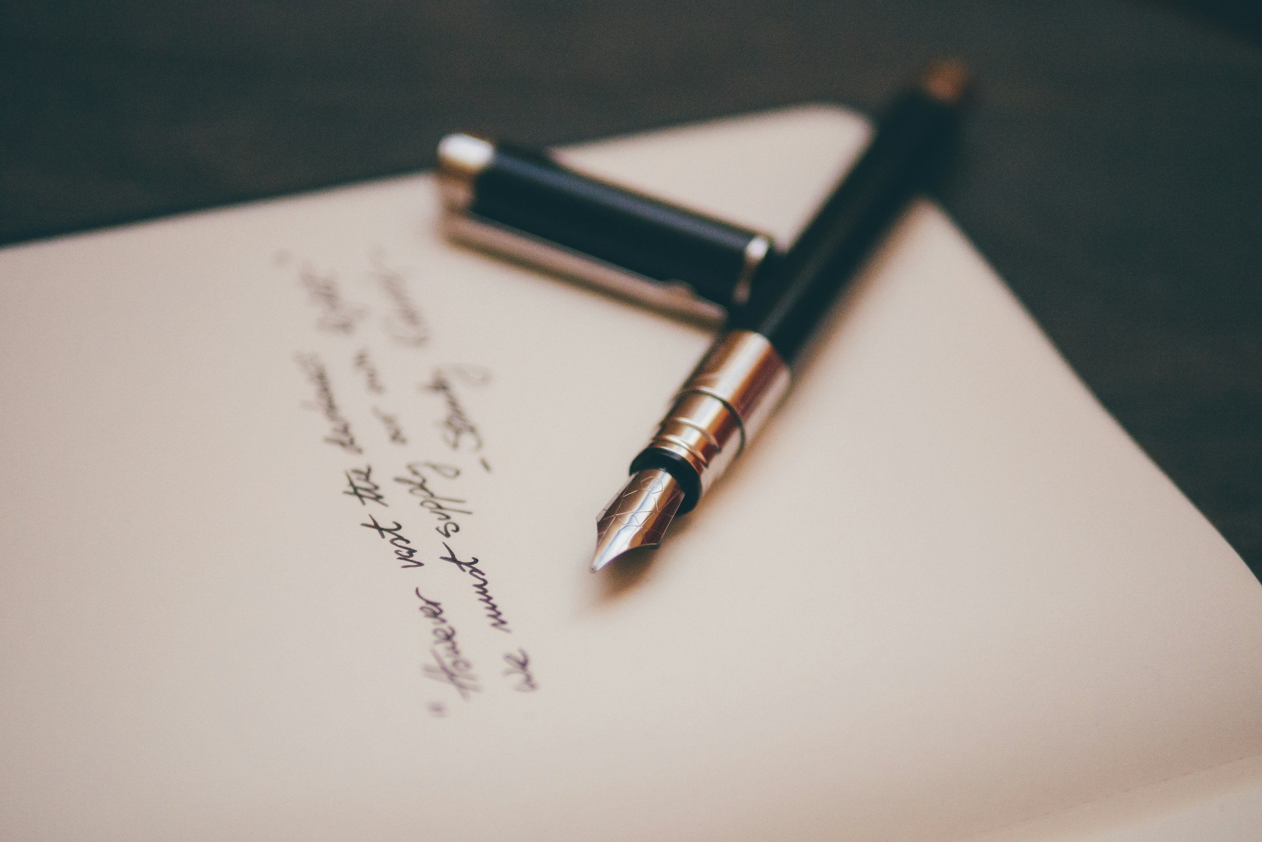
I wasn’t convinced of the value of a mood board until I took a design course that required creating one as part of the process. Since then, I’ve been a convert—completely hooked.
Building a mood board became one of the early fundamental steps in the process of developing an idea for a new collection. I had a rough concept forming in my mind, which I sketched out on paper before starting to collect visual references.
The Visual Anchors
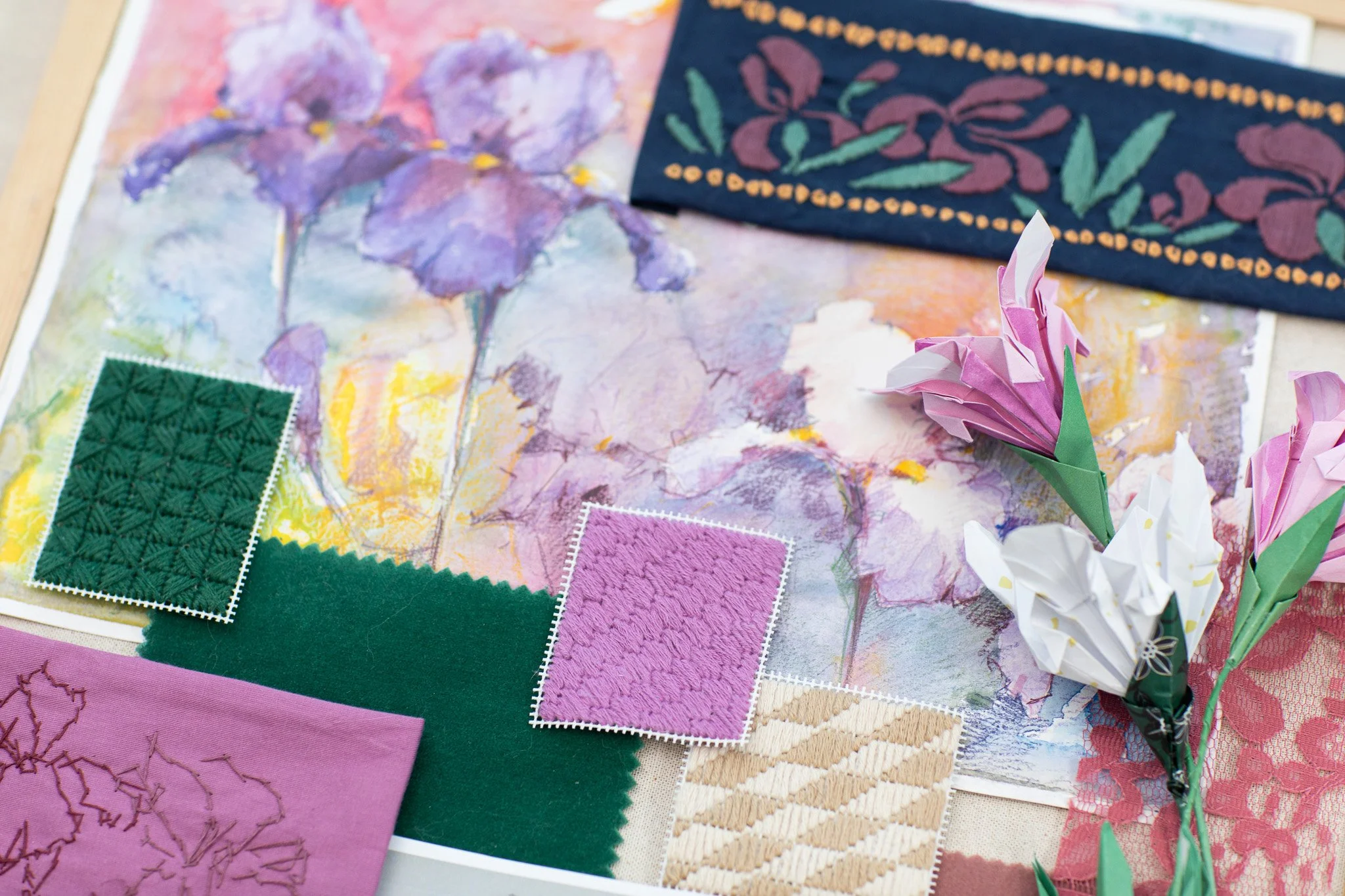
I’ve painted irises many times in the past—especially in soft pastels, which I find beautifully capture the velvety texture of their petals. I love the simplicity of the iris shape, which can be shown through bold pastel strokes, and its structure, which sets it apart from other flowers.
Until that moment in Florence, I had mostly encountered the purple and yellow variety. But discovering Giardino dell’Iris opened my eyes to the limitless colour possibilities of this bloom, adding a new dimension to my appreciation and love for the iris.
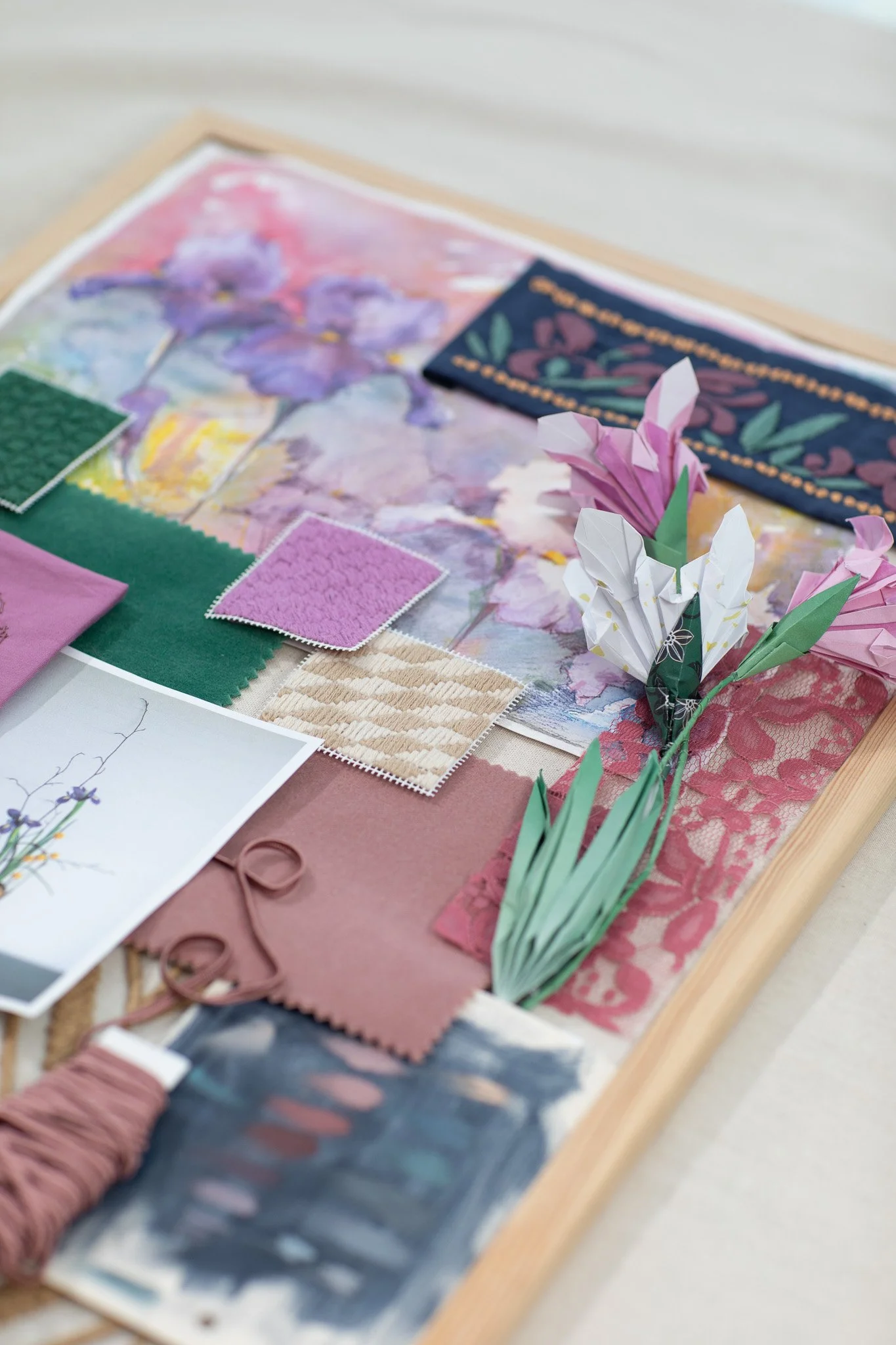
When it came time to start the mood board, I turned directly to the photos and paintings I had made a few years earlier. I was especially fixated on a deep, velvety red variety I remembered seeing in Florence. I knew I wanted this collection to pay tribute to the trip—but even more so, to the flower itself. And I wanted to do so using a somewhat unexpected, or at least less traditional, colour palette.
The small mixed-media painting I chose for the board has a huge amount of colour in it—from the classic iris purples to the more surprising pinks and blue-greens I had in mind.
I also pulled out a few textile samples I had at home—two velvet pieces in soft blush pink and calm pastel green. I have a somewhat complicated relationship with green. While it’s my absolute favourite colour, I’m not always drawn to using it in my artwork (with some exceptions). It can quickly become overpowering if too bright or intense. I was still uncertain about the exact hues I wanted to include—but velvet, as a textile, felt just right to evoke the texture of real blooms.
There’s also a piece of lace included, as a reminder that I wanted the designs to feel airy and light—even when using such a bold and striking flower as the hero of the collection.
The last fabric sample was from one of Harlequin’s collections. Its rough, couched texture—though very geometric—reminded me of wild, sun-bleached grasses in the areas surrounding the garden, beneath the olive trees and beyond.
Japanese Influence
At the centre of the board is an image found on Pinterest: a Japanese iris ikebana arrangement. I have a deep affinity for Japan—not just because I’ve visited twice (and plan to return as many times as I can), but also because of the endless inspiration I find in its traditional arts and crafts.
Ikebana seeks to reveal the essence of a plant with minimal elements. It is movement and stillness, line and mass, freshness and dryness—all at once. I have countless books on the subject and never tire of its aesthetic. For this project, ikebana became a guiding light—I wanted my work to carry that same feeling of restraint and intention. Throughout the process, it reminded me that the space between is just as important as the filling.
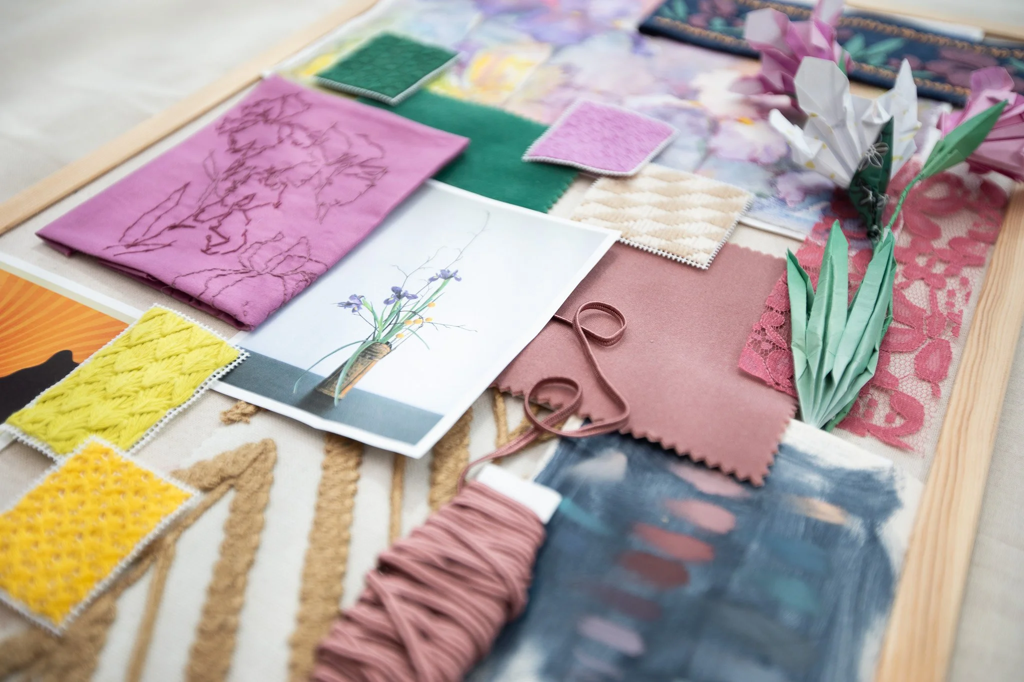
There’s also a postcard I picked up at Dulwich Picture Gallery during an exhibition of woodblock prints by the famous Yoshida family of Japanese artists. This particular print, Yellow Iris (1954), is by Fujio Yoshida—the first female artist in the family! I was struck by the unconventional angle of the flower and the unexpected palette. Since I was exploring a more unusual colour play in my own work, I included it as a quiet reminder. (I highly recommend looking up her work, as well as her husband’s—Hiroshi Yoshida—his landscapes are breathtaking.)
As I worked on this project in the depth of winter, with no fresh irises anywhere in sight, I decided to add some dimension to the board by creating 3D paper flowers. I found a few beautiful origami tutorials online, and after a bit of a struggle, I ended up with three paper iris blooms! It felt like another small tribute to Japan, and I was proud to include them. They added both depth and a touch of playfulness to the board.
Threads and Textures
The rest of the elements on the board are handmade. Creating embroidered and needlepoint pieces made the process longer, no doubt—but it helped solidify the ideas in my head. The very act of embroidery allows the mind to rest while the hands are busy. It creates a calm, focused space where new ideas can surface. And crafting something tangible at such an early stage brings a sense of real progress, even if it’s slow. I find great joy and satisfaction in that.
The needlepoint patterns were inspired by the photos I took of Florence’s architecture. I initially planned to incorporate some of its unique geometric forms into the designs, so I researched and selected traditional Italian stitches to create as inspiration pieces—specifically Florence (diagonal mosaic stitch), Bargello, and Milanese. But in the end, I only kept the Florence stitch on the board. While the others looked beautiful, they felt too well-known and widely used.
I also chose a few other stitches: Lozenge (which reminded me of Florence, though it originates from Eastern Europe), Cross-Corner Cushion (a simple but sophisticated stitch), and Star and Fan, which felt more nature-inspired. I saw them as a way to balance the geometric elements with organic ones.
Interestingly, none of the geometric patterns I developed made it into the final collection. While the embroidered pieces looked cohesive and fitting on the board, their flat digital counterparts in Adobe Illustrator lacked the same appeal. That might be one downside to including embroidered samples—they add a dimension to fabric that’s hard to match in other mediums. But I also see it as a healthy challenge: to push my final designs further, so they can hold their own—even without embroidery.
There are two cotton embroideries on the board. The purple-pink one was an attempt to “sketch” with thread—just a simple mix of long and short stitches outlining the flower shapes. It served me well! I ended up using both the colours and the concept of layering shadowy floral shapes in my final designs.
The second embroidery is more ribbon-like. Here I played with a more illustrative approach to the motifs, along with a slightly unconventional palette. I’m very happy with how it turned out—and elements from this piece found their way into two of my patterns.
Reflections
Looking back at the final version of the mood board, I can clearly see how its elements and colours helped shape my designs and kept me focused throughout the creative process.
Investing time into embroidery truly paid off—but I’ll be honest: at times it felt pointless, like I was procrastinating. The iris proved me wrong. And because of that, I’ll absolutely be incorporating this process into all future design work.
Naturally, things evolved along the way—especially the colour palette—but at its core, I stayed true to the original inspiration. I’m grateful for that.
This mood board wasn’t just a planning tool—it became a quiet conversation partner throughout the project. It reminded me to trust my instincts, to go slow, and to create with intention.
You can discover complete collection born from this inspiration here.
I’d love to hear how you gather inspiration for your creative projects.
If any of my musings resonated, is there anything you’d like to try incorporating into your own process? Get in touch or join our mailing list to continue the conversation.