The Inspiration Behind “Winter Like No Other” – Mood Board and Creative Process
Craft of Meaning - Design led studio, surface patterns, photography, bespoke art, storytelling
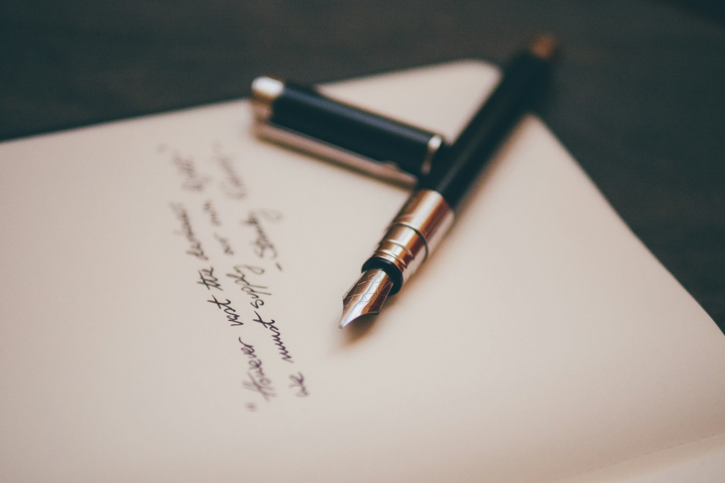
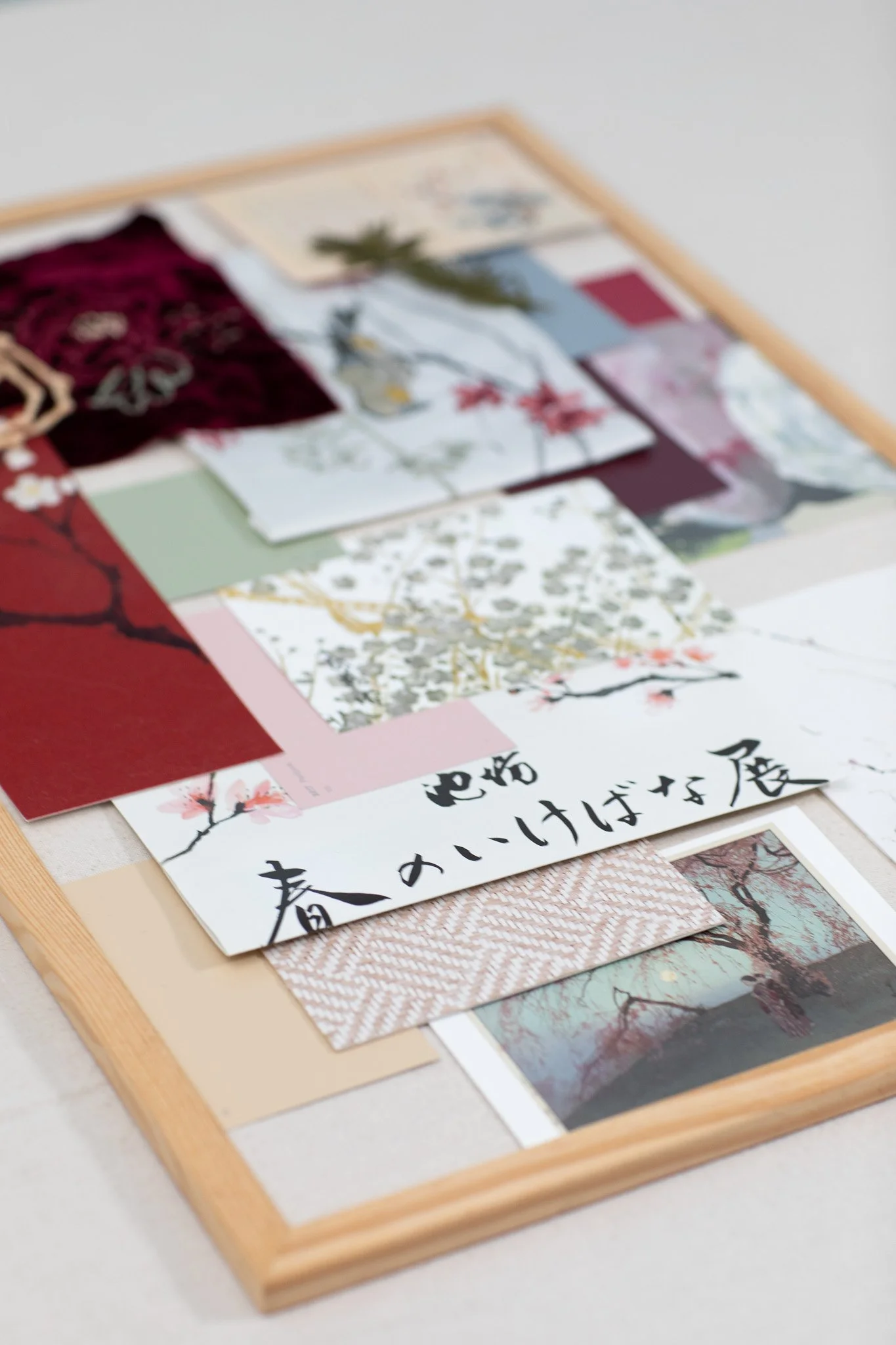
Back home, it was time to put pen to paper. Having enjoyed the process of creating mood boards for my previous collections, this one was no exception. But rather than being completed in a single sitting, it evolved slowly—gathered piece by piece, memory by memory, over the course of several weeks.
Color was my starting point.
We traveled to Japan during late winter, yet what we experienced defied the typical palette of the season. It was winter—but winter unlike any other. Nature was quiet but not barren, subdued but not dull. I wanted the collection’s colors to reflect that contrast between dormancy and abundance.
Bluish greys, both light and deep, along with neutral beiges, captured the dry straw huts and muted skies. The dark, nearly black branches of the plum trees added further structure. Then came red:
– The bright petals of camellias
– The deep burgundy of winter peonies
– The iconic red of torii gates
– Crimson and purplish plum blossoms set against the grandeur of Osaka Castle
– And delicate pinks from weeping plum trees
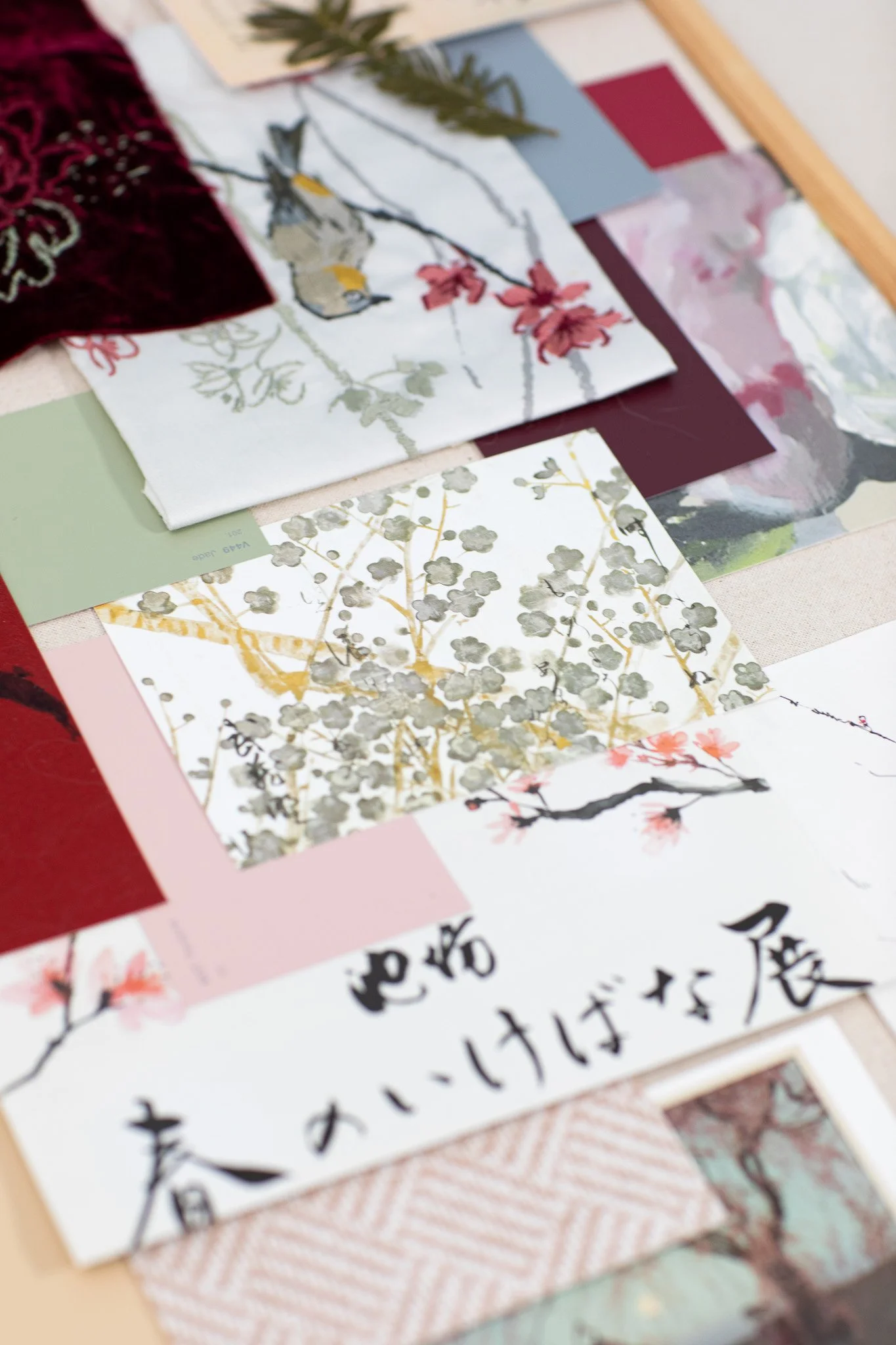
Greens were equally vital—ranging from the deep forest green of pine trees to the soft sage of bamboo stalks and leaves, to the vibrant feathers of the Japanese White-Eye birds we encountered throughout our walks.
I pulled in color cards to anchor the palette—a visual reminder of the memory I wanted to carry into the work.
Texture and sensory memory were the next focus.
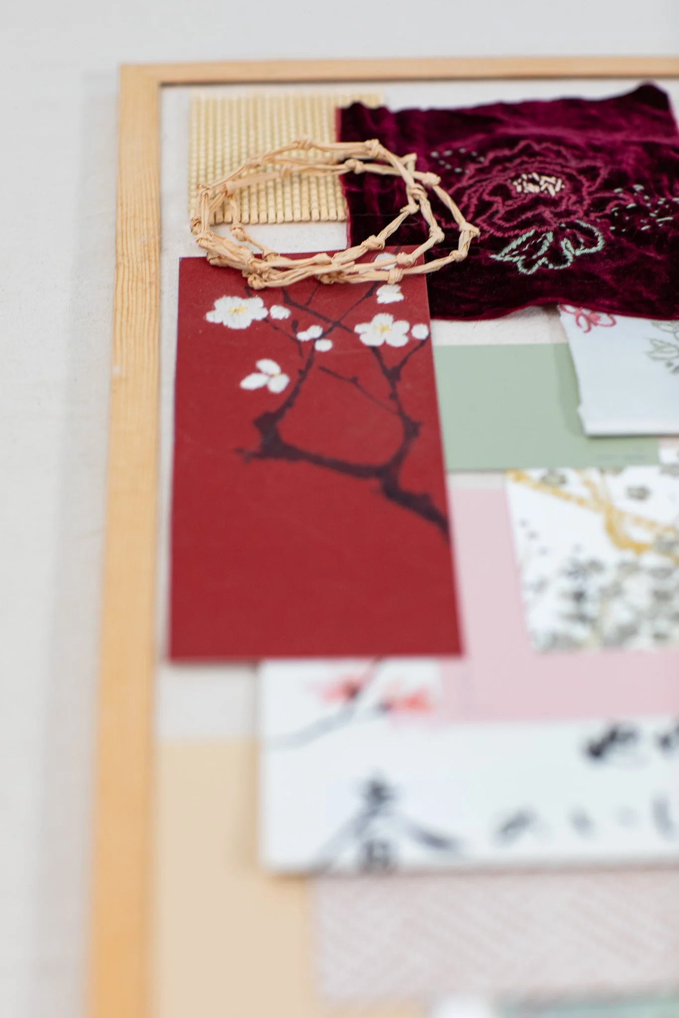
Winter’s backdrop, in my mind, called for rough organic linens—even when printed, they carry a sense of quiet calm. Peonies whispered “velvet”—soft, rich petals that feel as though nature made them from fabric. Straw huts, hibernating grasses, and the bark of plum trees all asked for coarse, tactile materials like raffia and bamboo.
To express that, I added a bamboo curtain sampler to my board. Its neat rows reminded me of both peony shelters and the uniform rhythm of bamboo groves. A piece of raffia with its imperfect, flowing edges brought the sense of wildness and texture I wanted to preserve. I also included a bamboo wallpaper sample from Phillip Jeffries in soft pink and off-white—an ideal balance between the season’s roughness and gentleness.
To further connect with that tactile memory, I created a small embroidery on dark burgundy velvet from my own stash. I could have added one of the many beautiful photos we’d taken, but stitching the piece myself felt more honest—like translating a feeling rather than just an image.
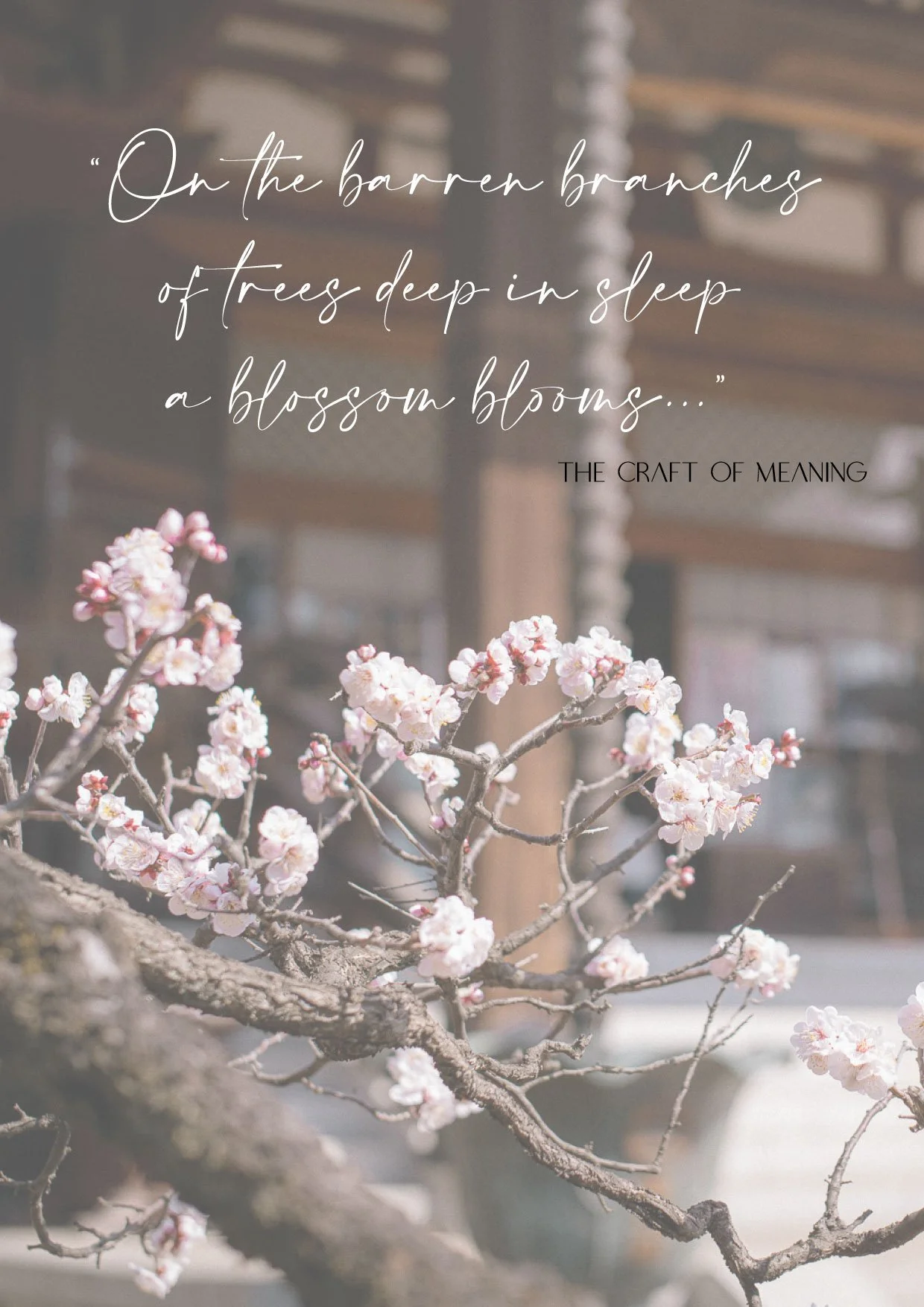
Plum blossoms were a revelation.
They appeared in so many variations—soft, round petals blooming directly from bare, dark branches. There was a quiet poetry in how the delicate emerged from the stark.
A little haiku came to me while wandering through the plum grove at Osaka Castle:
“On the barren branches
of trees deep in sleep,
a blossom blooms…”
My board includes a photograph we took in Tokyo’s Ebara Hatakeyama Museum garden of a Japanese White-Eye perched upside down on a plum branch. That photo now lives on every device I own—and also as a small metal print beside my desk. It reminds me of the joy and quiet wonder we felt in that garden.
Below it is a postcard I picked up at the museum, featuring a painting by Tawaraya Sōtatsu and calligraphy by Hon’ami Kōetsu. Its colors—muted, yet abundant—capture the paradox of Japanese winter perfectly.
Another photo I included was taken in Tokyo Midtown: a hidden torii gate framed by white plum blossoms nestled between the high-rises. That image, too, speaks of contrasts—of tradition holding its place within the modern city.
Even printed materials found their way in.
A flyer I picked up at Kyoto Station advertised the plum and upcoming cherry blossom festivals. The hand-painted watercolor branches and fluid calligraphy felt deeply personal. The spacing of its design—generous, uncluttered—echoes a key principle of Japanese aesthetics: the value of negative space. That quiet intentionality is something I strive for in my work, even though I often have the impulse to fill every empty corner. Embracing the in-between is an ongoing journey, both in design and in life.
To reinforce that mood, I added a sketch of an ikebana arrangement.
I found it years ago on Pinterest, sadly without credit, but its essence stayed with me: rough dark branches arranged with quiet grace, a red bloom and two buds anchoring the composition. The space around it wasn’t empty—it was part of the art. It didn’t ask to be filled.
The final piece I added is a reproduction of a work by Yabu Chōsui: “Three Auspicious Friends: Pine, Bamboo, and Plum” (c. 1860).
This trio—often referred to as the Three Friends of Winter—symbolizes endurance, resilience, and hope. That symbolism was foundational to this entire collection. Two evergreens and one unexpectedly blooming tree—together they remind us that even in the coldest season, life persists. Spring will return.
In many ways, working on “Winter Like No Other” helped me stay connected to our Japan trip.
So often we rush to plan the next adventure the moment one ends. But lingering in the “aftertaste” of an experience—through reflection, creation, and storytelling—extends its impact in ways a passport stamp never could.
Looking back through photos, sketching memories, and stitching together these fragments allowed me to not only remember but embody the journey.
I’m so grateful for that.
You can discover collection born from this inspiration here.
How do you hold on to beautiful experiences after they’ve passed?
Do you allow yourself time to absorb the afterglow, or do you find yourself already looking ahead?
Get in touch or join our mailing list to continue the conversation.