
Translating Landscapes into Mood and Story
Craft of Meaning - Design led studio, surface patterns, photography, bespoke art, storytelling
The core idea for this body of work was to bring together two opposites: the calm expanses of rolling hills in muted tones, and the wild abundance of form and colour found in the English Gardens we came to enjoy on our travels.
The starting point — and anchor — for the whole mood board came from two photos we took during the trip, each perfectly capturing the duality at play. One was taken not long before sunset over Lose Hill, with a hazy glow and a lone tree standing quietly in the distance. The second was a close-up of gorgeous dahlias taking centre stage, with a chorus of greenery and blossoms behind them.
Placed on opposite corners of the board, the task became adding just enough to balance the contrast without allowing one side to overpower the other.
THE GARDEN (The Abundance)
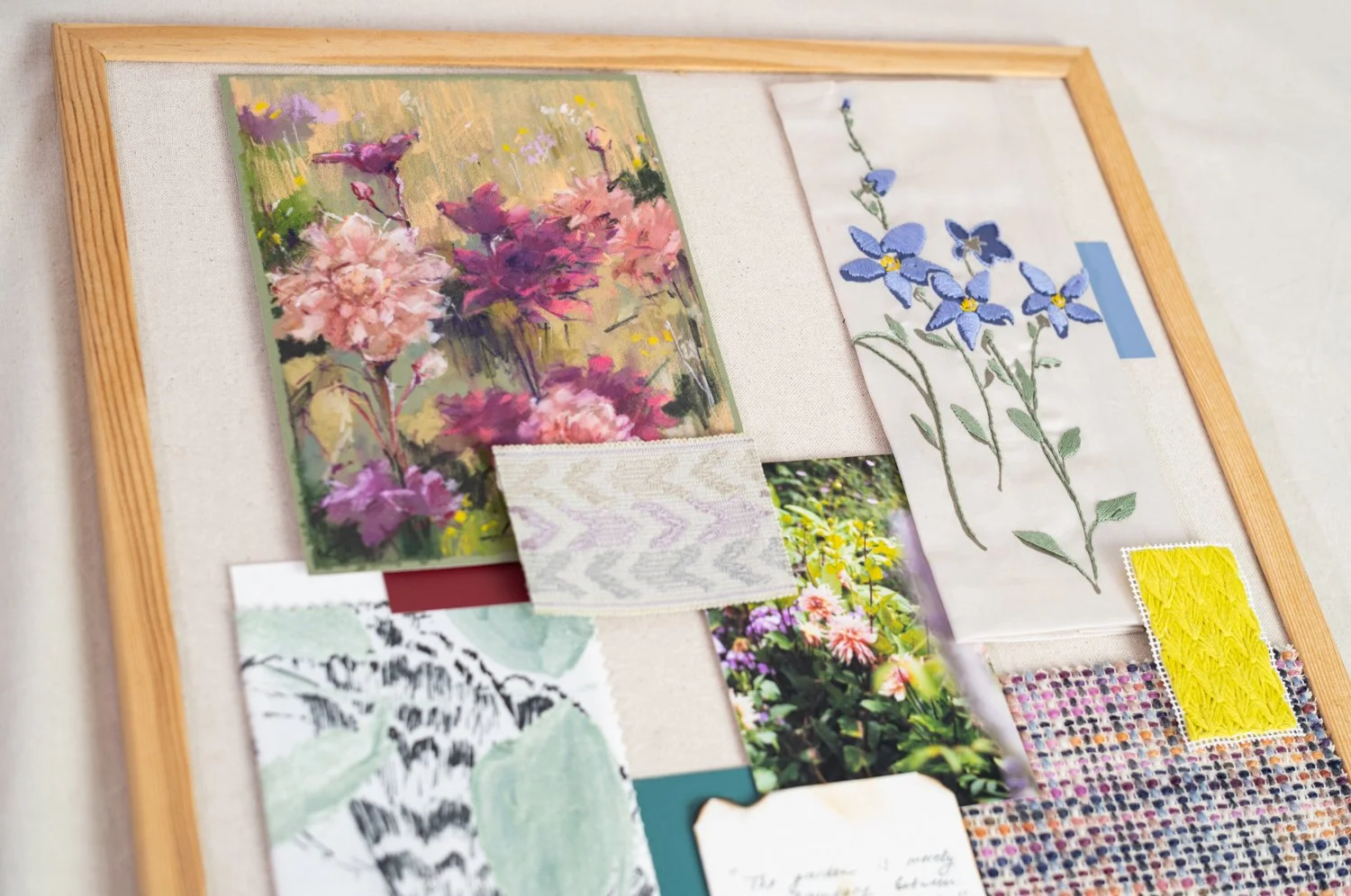
To convey the sophistication of the garden and the abundance of flora we witnessed, I immediately thought of the Impressionists — especially my favourite, Monet — and how their joyful colour choices and free, airy brushwork reflect the feeling English Gardens always leave me with.
As I sifted through my books and a stack of postcards collected from museums over the years, I picked up a book on Klimt. Most people associate him with luminous female figures and his unmistakable use of gold — The Kiss, Portrait of Adele Bloch-Bauer, Judith and the Head of Holofernes, and so on. I never associated Klimt with landscapes, so coming across a selection of them in my Taschen volume was a quiet revelation.
In the second half of his life, Klimt devoted himself passionately to landscapes — gardens, flower scenes, water, and forest edges. Spending his summers away from Vienna, physically removed from patrons and commissions, he embraced nature for himself. It became a space where he could explore new painterly attitudes, unrestrained and instinctive.
Compared to his sumptuous figure paintings, the landscapes feel calm, almost shy, yet undeniably abundant. Like nature itself — not there to impress anyone, simply dressing in the best of the season. I saw in Klimt a similar contrast of lushness and gentleness, of opulence and quiet charm — the very contrast I was seeking for this new body of work.
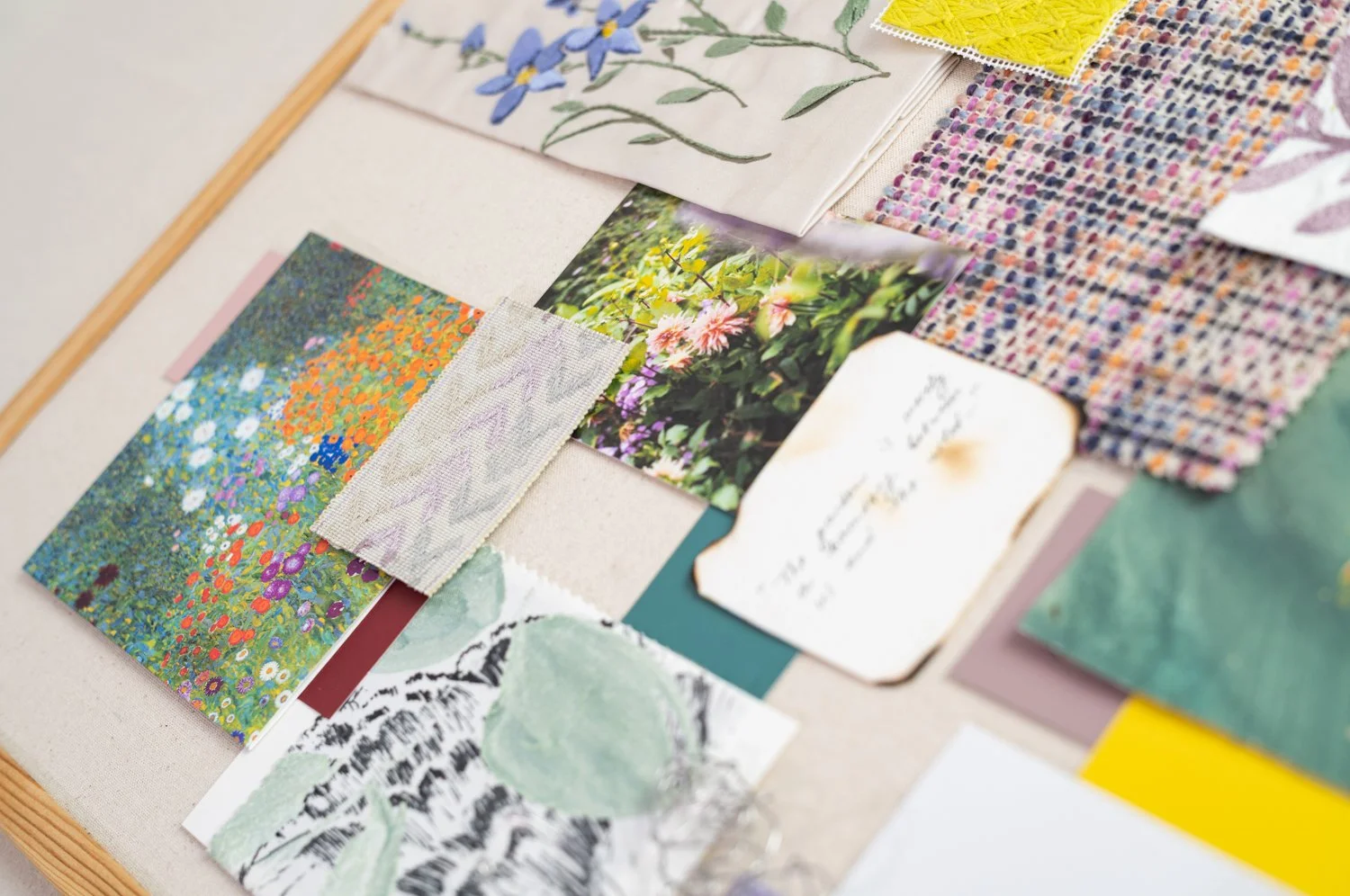
A postcard of his Cottage Garden (1907) became an instant fit and found its rightful place on the board.
My own embroidery of bluebells sits at the threshold between the garden’s lush abundance and the landscape’s quietness. While we saw countless florals in varying shades of violet in the gardens, the humble bluebell appeared in the most unlikely place. I found a few of them growing wild during our visit to Winnats Pass — not on the ground among grasses, but high above, growing sparingly out of cracks in the rocks. Small, fragile flowers thriving in such harsh conditions… That image of resilience stayed with me and simply had to be acknowledged as future inspiration.
Winnats Pass itself is a place shaped by deep time — its towering walls carved from the limestone of an ancient tropical sea that once covered this land. Even without knowing the full geology, you can feel that vastness in its cliffs: the quiet weight of something far older than any garden or footpath. Somehow, that sense of time made those few bluebells even more moving — small, delicate blooms rooted in rock shaped over millions of years.
Continuing with violet — a colour that seemed to follow us everywhere — its pairing with yellow became impossible to ignore. In every garden, large or small, some variation of yellow and violet blooms grew side by side, creating joyful bursts of colour capable of brightening even the greyest surroundings. Incorporating the pairing into the final palette became non-negotiable. To give this idea a tangible place on the board, I added plain colour cards and a quick sketch of yellow and purple blooms.
And of course — no summer garden exists without bees, insects, and butterflies. While gardens serve as a feast for our senses, they are quite literally lifelines for countless creatures. Watching bees buzz around and butterflies drift through the air added another layer to the experience. Living in a big city, we rarely witness nature thriving with such ease, so these moments felt especially heartwarming.
Finding a way to represent this feeling took some thought. In the end, I pinned a small textile swatch with a sketched butterfly wing, and shaped a simple butterfly out of a single piece of wire. I intentionally kept it organic — no measurements, no mirrored perfection, just the essence and appreciation of nature’s forms. On its own it may be small, but structurally it became the bridge between the two halves of the board — a final gesture of the garden that gently leads us into the quieter landscape.
THE LANDSCAPE (The Quiet)
The landscape side, anchored in the Lose Hill photograph, is supported by a few natural elements — stone and wood, both in their wild form and in more crafted variations.
The small stone wasn’t found in the Peak District, but on the shore of a little seaside town in the south of England that we visited after returning from our holiday. The colours on its surface held the same palette as the hazy evening we spent watching the sun fall behind the hills — so I knew instantly that it had to come home.
Two pieces of twisted driftwood, though collected years ago from another coastline, felt surprisingly fitting here. The Peak District is full of trees and shrubs with branches shaped by wind into curious, undulating forms, so these little foundlings visually grounded the quiet nature element.
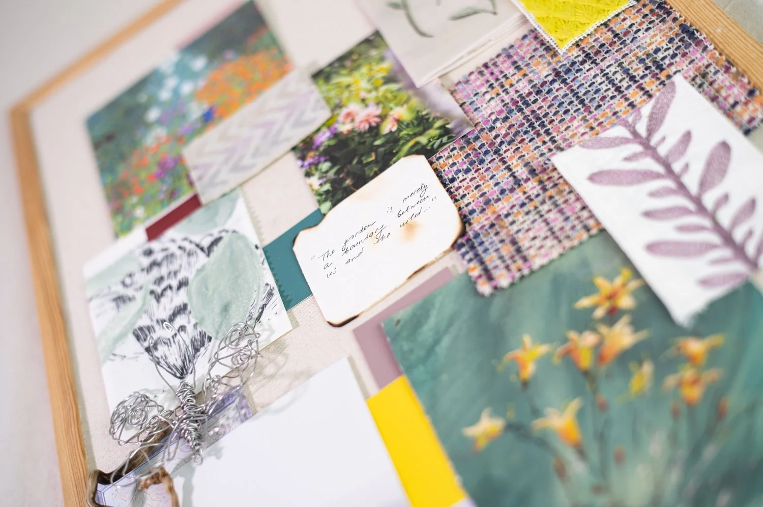
Wood appears again in the form of a printed photograph I took in Haddon Hall. Its walls are adorned with exquisite wood panelling — the work of craftsmen long gone, chiselling portraits, landscapes, and decorative motifs into the grain.
The piece I included features Elizabethan carved strapwork. There is something grounding in its curves and angles, in its ancient geometry. In my mind, this element helps the whole board find its home: England — the place at the heart of this work.
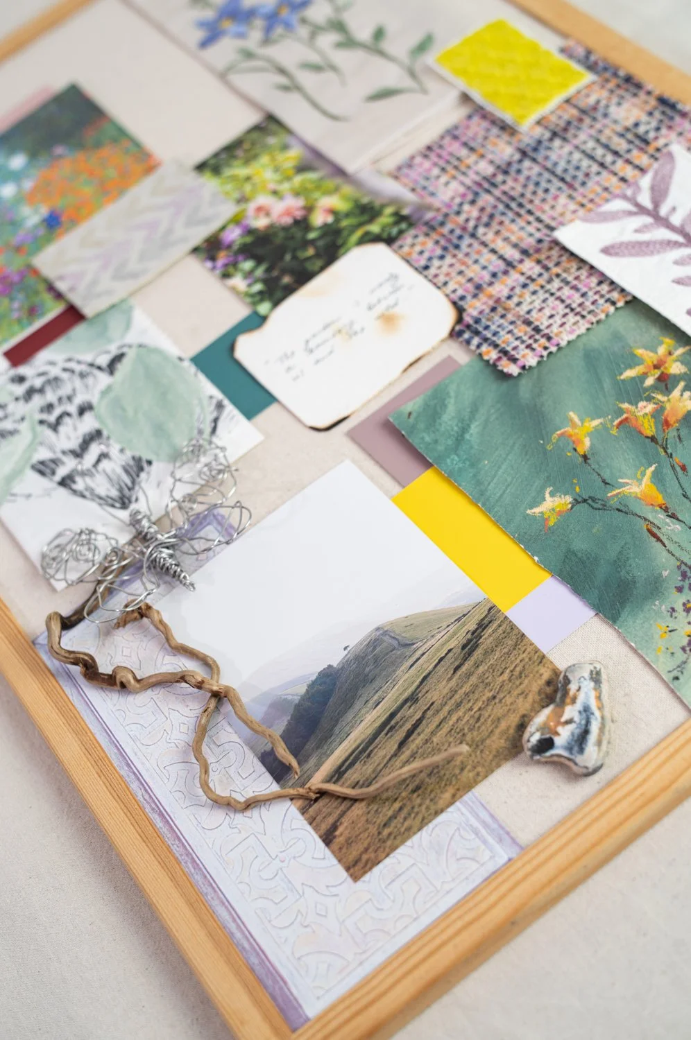
Another essential piece of the landscape was the simple grasses covering the hills, always alive, moving with even the slightest breath of wind. Witnessing their fluffy golden heads illuminated by the setting sun was a balm for the soul.
To connect with the quieter palette of the hills, I added two small ribbon embroideries to represent these grasses, grounding both colour and texture.
The final piece that ties it all together is a textile sample combining purples, blues, orange, and small whites — like tiny sheep scattered across hilltops, grazing at leisure.
And then — the “cherry on top” — the centrepiece of the board: a quote I found beautifully fitting for this project:
“The garden is merely a boundary between us and the wild…”
It made me pause.
How did we become so disconnected from nature?
What is this primal pull that still makes us want to be near it — whether through a vase of fresh flowers, a balcony garden in a high-rise, or the small patch of land someone lovingly tends behind their home?
Maybe it’s our way of remembering where we come from.
Maybe it’s a way of bringing a small piece of the world closer, so that we may breathe easier within it.
How do you bring the wild closer to your home?
Whether through plants, memories from your travels, handmade objects, or something entirely different — we would love to hear from you.
You can discover collection born from this inspiration here.
Get in touch or join our mailing list to continue the conversation.